

Brand design trends in 2023 reflected the uncertain state of the world. From the nostalgia of retro video games to the bold embrace of futuristic aesthetics, brands are trying to provide reassurance and a bit of escapism to audiences. But what were the most influential trends that we will take forward into 2024?
What we saw in 2023…
3D illustration
So much advertising this year featured bulbous 3D illustrations. This surge in 3D design is attributed to the accessibility of 3D software. This trend has manifested in two forms: playful, cartoon-like illustrations such as the rebranding of Omlet, a pet care brand, by Ragged Edge; and 3D typography, particularly of the colourful, tubular variety. Among the campaigns to adopt this is That Reading Feeling Awaits by Droga5 for Amazon Books. This trend is expected to continue into 2024, keeping the stylistic elements, but perhaps becoming more intricate with the help of AI.
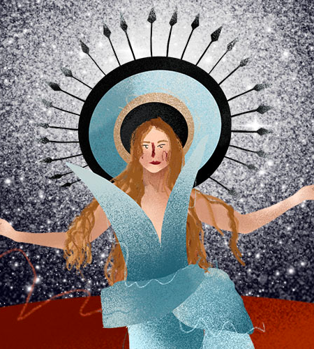
Colourful surrealism
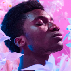
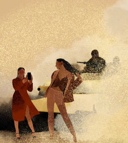
The design world is no stranger to escapism. However, since 2020, the call for escape has been getting louder. In 2023, we turned to surrealism that is maximalist, brimming with vibrant colours and overwhelming sensory experiences. This intense style serves as a portal away from our dystopian reality, submerging us in a world that’s less about literal representation and more about evoking the emotions.
The award-winning Bodyform Periodsomnia campaign captured the painful, sleep-disturbed reality many experience through imagery that conveyed intense discomfort. With novelty of the aesthetic of AI-generated images wearing off, this trend is likely to start dying out in 2024, replaced by a different type of surrealism.
Futuristic nostalgia
On the flipside of the collective desire to get lost in a technicolour dreamscape, there’s the appeal of the comfort of the recent past. This is manifested through ‘futuristic nostalgia’ — where the allure of the ’90s and early noughties is recreated using modern technology to appeal to modern sensibilities.
It reflects our tendency to romanticise the past by combining the best of both worlds — the fun visuals of pre-2000s tech and the convenience of today’s tech.
Nike’s campaign by AKQA Never Done Evolving embodies this trend by masterfully blending elements of 16-bit games with futuristic 3D, body-tracking visuals, creating its own unique look. The desire for this comfort is unlikely to leave us anytime soon, so expect to see this trend in the years to come.
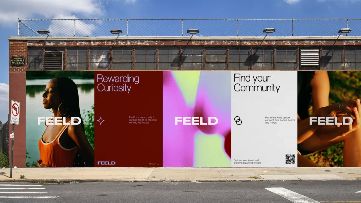
Y2K gradient
We aren’t ready to leave the Y2K aesthetic just yet, and the design world still clings on to the Y2K gradient trend. This fluid gradient is composed of playful, soft colours and simple, sometimes random, shapes. In addition, it often comes with a grainy texture, making it resemble an old teen gossip magazine.
It has primarily served an aesthetic purpose, however there are some standout examples where the gradient use is emblematic. We encounter a meaningful Y2K gradient in the rebrand by Made Thought of the dating app Feeld. Here, the gradient serves two purposes. It represents the fluidity of sexuality without relying on the clichéd rainbow motif, and it adds a layer of engagement.
The purely visual functionality of this device means that it has less staying power, meaning it likely will die out in 2023.
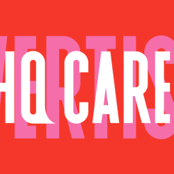
Stretchy typography
Stretchy typography was also hugely popular this year. This type of font manipulation is used to symbolise the adaptable and flexible nature of a brand, appealing to our need for convenience. Alternatively, it can represent a brand’s commitment to diversity. Omar Mobarek, the graphic designer for the workout program Fit Like Malak, believes stretchy typography symbolises ‘all the different types of forms that surround us.’
A creative implementation of this typographic style can be seen in In-House Intl’s rebranding of the non-profit organization Fusebox. Here, the elongated letters aren’t just a stylistic choice; they’re cleverly used as a framing device. This trend is also found in WMH&I’s campaign for TEM-PLE, a music duo raising awareness of Ehlers-Danlos Syndrome. Here it represented some of the symptoms of EDS, stretchy skin and hypermobility. The 2023 design world was borderline oversaturated with stretchy fonts, so it’s doubtful that this style will be used much in the coming years.
Candid product photography
The rise in candid product photography reflects how brands are striving to present themselves as genuine, relatable and unfiltered. Colour Mill’s rebrand by Universal Favourite uses this style to go beyond authenticity. The product photography is artfully messy, where each image tells a unique story. The photos are reminiscent of the colourful and intricate scenes found in I Spy books, but still spontaneous. As time goes on, brands will act more and more as a friend to a consumer, rather than a corporate entity, and this candid product photography is a reliable way to achieve that.
What we are going to see more of in 2024…
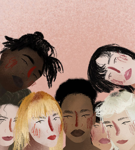
Imperfect human touch
Many trend-spotters predicted that the imperfect human touch would be an important 2023 trend, but while it didn’t quite take off this year, I believe that it will have its moment in 2024. After all, embracing the beauty and importance of failure has been a major theme in marketing.
Live-action brand mascots
2023 saw the birth and revival of live-action brand mascots that captivated the audience, such as Dice’s furry puppet mascot and the return of Hofmeister’s George the Bear. In 2024, this trend is sure to continue. Seeing them truly exist in our world, rather than being digitally inserted into it, adds authenticity and relatability that can be hard to achieve in 3D animation.
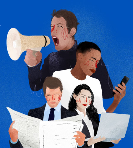
A sea of sameness?
I also did a straw poll among my colleagues for their forecasts for 2024. They foresee the continued rise of surrealism, 3D hyper-realistic designs and bold colours. But, with AI continuing transform our approach to design, their predictions also came with this stark warning: we will get more of the same and it will be harder to disrupt.
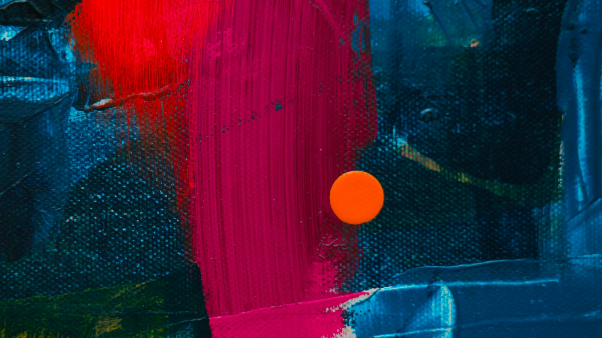
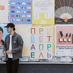
Featured image: John Jennings / Unsplash