


Clowns, tigers, bunnies, Barbie… brandland is full of iconic mascots. When making lists, however, it’s usually the same 10 to 20 heritage brands that come to mind — those who represent nostalgia, childhood and pre-streaming TV. That’s because it’s hard to get a brand mascot to stick. Many try and fail to connect, or completely turn people off (e.g. Burger King’s mid-2000s creepy plastic-faced King). Relatively few stand the test of time.
Here are some key aspects of successful brand mascots, and the brands that have made it work:
Relevance
It’s not enough to add an animal or cartoon character to a logo and call it a day. There must be a reason, a connection to the product itself. Bird’s Eye sell fish products, so they have a captain. Energizer and Duracell sell batteries which make things faster, so they both have/had bunnies. Just because something is relevant, however, doesn’t automatically make it a good fit. Mucinex created a mascot out of a ball of mucus. Recognisable, but perhaps not the most appealing.

One of the best, and simplest, examples of keeping things relevant is M&M’s, with their introduction of their anthropomorphised sweets. They simply took the product, made it talk, created two buddy characters (plus a few other colours along the way), and now they have an empire of M&M’s Worlds across the globe. Sometimes, the simpler the better.
Storytelling

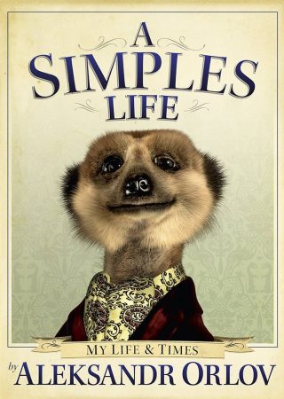
One way to make a mascot last is to go in with a long form story you want to tell. When Compare the Market launched its now-iconic, ongoing ‘Compare the Meerkat’ campaign, the new Russian meerkat character had a full name, Aleksandr Orlov, and a backstory to boot. He was so popular, that he even released an autobiography A Simples Life: The Life and Times of Aleksandr Orlov, launched a huge range of meerkat toys, and a family of cute characters, and recently, a wombat friend.
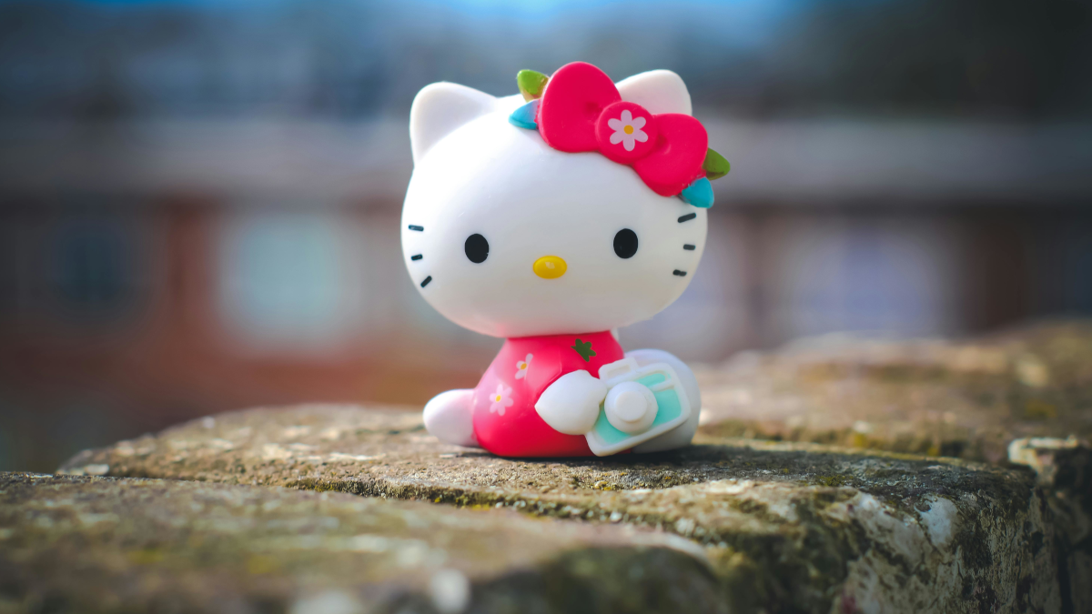
Cuteness
It’s a fine line between cute and creepy, but if done right, the cuteness can create an empire. Just look at Hello Kitty. Food and beverage are full of long-lasting cute mascots, often appealing to children (though this of course can be controversial if it’s unhealthy food).
In the UK, one such icon is the Freddo, a small frog-shaped chocolate with matching frog logo. Freddo the frog follows very standard cute naming conventions, like other icons Colin the Caterpillar (see also the Cuthbert the Caterpillar brand war) and Percy Pig. You’d think it wouldn’t stand out much. The Freddo, however, has become iconic as it is used as a measure for inflation, and the country failing (the ‘Freddo Index’). The Freddo, for many years, cost only 10p. In the last 10 years the price has gone up and up, and there is universal outrage. It’s about 49p now. Daylight robbery.
Irreverence
Perhaps the trickiest to get right, but hugely impactful when it lands. In the ’90s, UK soft drink brand Tango’s aggressive ‘You Know When You’ve Been Tango’ed’ campaign featured a man painted orange slapping people in the face. It has forever singled Tango out as a soft drink with a difference.
Nowadays, Duolingo’s angry owl dominates TikTok, one of the only brands that can get away with being funny on social media. It has gone from a logo to a formidable presence, constantly chasing people in videos to get them to do their daily Duolingo and leaving irreverent comments in random places.
It’s not just nostalgia
Most lists of best brand mascots focus on older iconic campaigns, but as brands like Duolingo and Hootsuite (who also use an owl) demonstrate, new mascots can be just as effective. Characters aren’t right for every brand, but they can help you stand out, enhance recognition, and sometimes take on a life of their own. Just try not to be creepy.
Featured image: Henk Mohabier / Pexels