If we think about it, signs and OOH media have woven themselves to every period in history: from cavemen practising graffiti in the Upper Paleolithic; from the original ‘8 mile’ mural found in the Amazon to the boujee glyph scene (and sustainable papyrus category) of the Nile. Fast forward to the fifteenth century and fly-posting got popular in Western Europe, way before East London considered it fly. From Michelangelo’s Sistine Chapel to medieval pubs and taverns, using painted images of lions, snakes, crowns, sceptres for those who couldn’t read or write.
In the late 1800s it was a natural step for advertisers to embrace the broadcast power of hand-painted signage. Here we celebrate the birth of Large Format Outdoor advertising… brands adorning the brickwork of every city and town with their distinctive codes. In short: painting brands onto buildings is the original brand building on a monumental scale.
Advertising murals were mostly found adorning the flanks of retail shops, huge painted signs which drove salience for brands, whilst serving a propinquitous prompt to purchase. More than a hundred years later these revered ‘ghost signs‘ offer a window into the past, and yet feel familiar and personal. A creative vestige we still cling onto, from a creative perspective. As civilizations evolved, so did OOH techniques. Through the evolution of lithography, photography, technology, public infrastructure and commerce, the land. The popularity of motorcars and public transport in the 1920s drove Roadside Billboards to proliferate on Britain’s highways and byways. OOH also played a role in economic rejuvenation after the second world war. Some of this billboard estate is still standing today.
The 1980s to the noughties saw cost-effective broadcast printing techniques, illuminated signs, rotating prisms, scrollers and vinyl skins. Today, digital screens are the most ubiquitous medium, signalling the beginning of the end for the humble paper poster. Or are they?
The phoenix that keeps rising from the ashes
OOH keeps moving with the times, and yet goes back to what made it special in the first place: its simplicity, desire to be distinctive, public nature, and signalling power. But every phoenix has its challenges, the things that it needs to overcome before rising again. And the history of OOH is no stranger to these either… eye-popping, jaw-dropping, spine-tingling moments which work hard to summon attention from audiences and fuse themselves to culture (IRL and URL). OOH has the power to bring some of the best ideas to life. The creative effort and standard we set as advertisers is the creative bar our competitors need to beat.
A battle of talent where attention is earned and won, not forced or coerced. And while Faux Out Of Home (FOOH) is the latest iteration of the phoenix rising, we wanted this piece to spotlight those who are making very real work which is affecting very real people’s perceptions of brands.
Burning the playbook, yet helping it rise higher
It’s all well and good to celebrate the history of a medium, but let’s face it, our industry thrives on looking ahead, or at least looking around. So when we do look around, who’s intentionally either burning the playbook or helping OOH rise? I asked copy chief extraordinaire Vikki Ross for some help on this one. Let’s look at some posters, shall we?
In no particular order we start with Alex Taylor’s work. Among many other pieces she was behind the excellent Castlemaine XXXX ads which, to this day, would still XXXX up your feed.
Or let’s take a moment to admire the dramatic beauty of these posters by Sue Higgs.
Or consider what photographer James Day and Uncommon Creative Studio did, so simply and yet so beautifully; to get us all to be less afraid of doing some DIY.
Or consider what Jo Wallace did when the brief was to raise awareness of the surge in domestic abuse during the 2020 lockdown. Hard to digest, impossible to ignore.
Consider, on a different note, these lovely ‘freedom day’ posters by Alex Holder and Oli Beale.
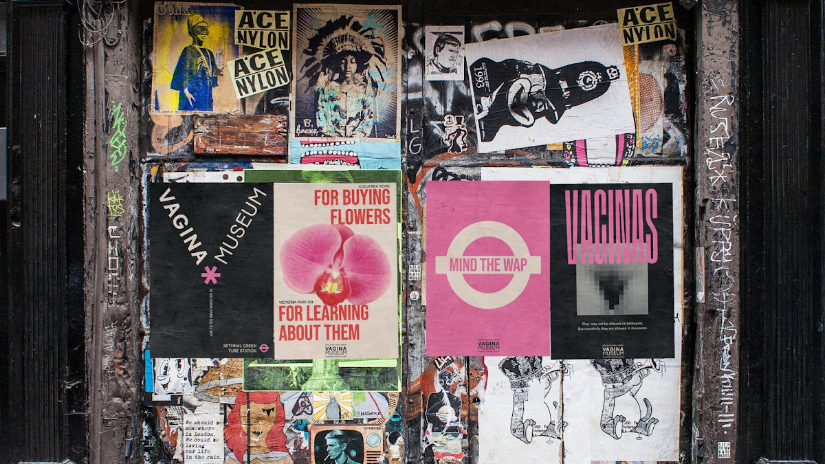
And who can forget the epic simplicity of what Nathalie Gordon did for the Vagina Museum?
Oh, you know those original British Airways posters by Uncommon? That was Olga Pope.
And remember those specifically about flying from City Airport? That was Ellie and Elisa.
And who doesn’t love a poster with that little extra bit of craft? Via BBC Creative’s Shan & Beth.
And remember when Cadbury put an Aussie on a billboard to talk about a delish chocolate bar? That was the work of Ben & Adam.
And who doesn’t love a poster with a bit of media-led mischief? Via Josh and Chanelle.
All those lovely Specsavers posters? You can thank Nicola Wardell’s team at Specsavers Creative.
The point is simple: behind standout posters there are incredibly sharp and smart people. And the next time we think that a medium is dead or dying, or ‘not quite what it was’, we’d be wise to remind ourselves of this. Ignore the snarky commentators and look at the crafts men and women instead. They might offer better signals about the future than a panel of ‘futurists’.
Featured image: Vagina Museum posters

