


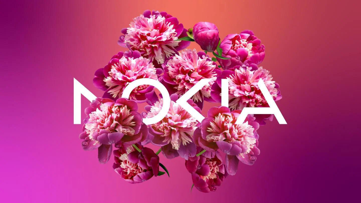
Nokia launched its new logo, the brand’s first in over 5 decades. Leaving behind the iconic blue background and simple white letter forms, the new logo follows a more modern, deconstructed pattern, introducing a new era in the company.
The new logo aims to bring a breath of fresh air to the technology company, which for a long time was synonymous with phones. The launch of a new logo is an attempt to change this association, said chief executive Pekka Lundmark, and establish the struggling company in the technology field.
With the rebranding, the company will also pursue a different business strategy that Lundmark describes as ‘reset, accelerate and scale.‘ Within that framework, Nokia will focus on selling equipment to other companies, moving into the B2B field. The company already has some experience in this, but aims to grow its enterprise business in the years to come.
Featured image: Nokia new logo